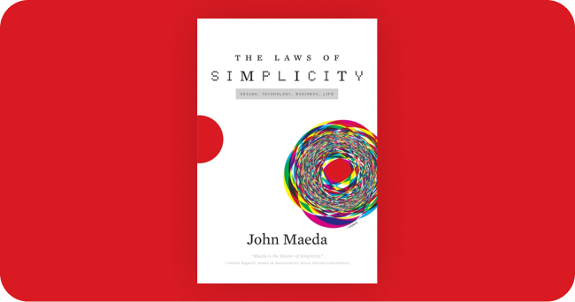
After years in my backlog I finally read The laws of simplicity by John Maeda.
I was so ready to dive into what I thought was a product design classic on achieving simplicity. It wasn’t. The book consists of mostly personal musings on random topics, most of them unrelated to simplicity. Nothing against random design-meets-life essays, only that its title felt deceiving.
But it had a couple of moments of light. One of them was on the importance of information architecture, that was brought up not by its name –maybe because the book’s from 2006, almost ancient– but as the simple question of what goes with what?
All of the sudden that Marie Kondo question struck me as the backbone of user experience and got me reflecting on why is it that is so challenging for everyone to work on it. I might be speaking for myself, but information architecture and taxonomy are usually subjected to some degree of unseriousness.
Not sure where this comes from. It could be because working on the IA doesn’t look like designing. Or maybe stakeholders see it as an afterthought because they’re unaware of its importance. Maybe low-key we all know it and find it daunting?
Screens and wireframes can be nice, but information architecture is at soul-level. It’s one of the main chakras of UX. Having some clarity and definition on what goes with what early on can save everyone a lot of suffering and a lack of direction later. There’s nothing wrong with letting the content inform the design of the container.


